Wednesday, 9 April 2008

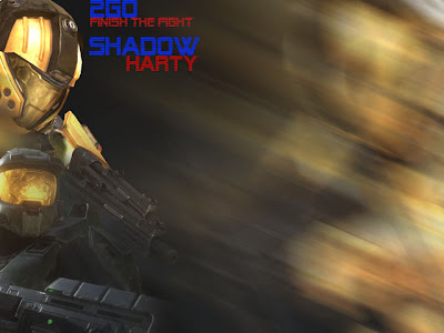
Playing With Blurs


I am very proud of this finish, if you wondered i like the
colours orange and black, the contrast and vibrance has
some strange effect on me :P
The main of the image is the orange guy on the left,
who looks exactly like the guy i use on Halo 3. Then the
2nd guy lower left is as close to my m8s character as i
can guess.
The blur on the right was taking from the spartan who
was flipped and offset from the canvas, then i dragged
the motion blur across towards the NW. Its not just 1 blur
i kept dragging it further so it was a gradual fade,

the text : i dont know

But it is the size of my desktop and is my wallpaper.

Tuesday, 4 March 2008

Clock Animation

This clock is for the victorian theme

Tuesday, 26 February 2008

College Animations

Animation 1:
Freewebs

This animation is of the process when sugar dissovles into water, it was aimed at the younger generation of people and is really basic to follow

Animation2 :
Freewebs


This animation is a more complex one. It is a 2 stroke engine, The industrial process model.

Friday, 15 February 2008

Crazy Modding

I am thinking of personalizing my ipod and its amazing what can be found on sites
This ipod was made by Joshua Driggs and his guide link is posted below.

It has a very unique feel and would definitely increase its appeal to hold it and be proud to spend money on it.

But there are other mods as well which are amusing but very clever...

I am very eager to do this as it would be a very good project, but i want to be unique myself, because following a guide is like cheating in a game, you know there will always be better than what you did. I just need a lot of ideas.... to work from, and a theme to work around.
But for know ill be at the drawing board stages of this project and will be a long time before im showing it off. Can't wait for this if it works though.

LINKS
---------
Case Modding Site for anything and everything - CaseMod
Wooden Ipod Guide - bit-tech

Tuesday, 8 January 2008

The Bear Strikes again


The Bears Back To Strike Again!!And he has serious face!

Photo Adapting

About the image
The image is of my Grand-Dad with my sister and cousin
(I'm not in it because I don't want to embarrass myself)


Original Copy
This is an image I have used for my folio for a scanned image. It is an old photo from many a year ago (before i was even born) I decided to enhance it though whilst waiting for a massive download. So I went onto photoshop and played with the Filters, Effects and Colour Channels. I also cropped off the old faded border (not to sure on what to call it) And I also used the clone tool to get rid of the scratched / damaged sky parts.


Random Effect I can't find anymore
This effect basically involved me placing a screen sheet over the image which had a gradient radial fill going from a orange to transparent. This is instead of using a colour overlay which would have been slapped all over the image. I guess the aim of this was to make it look old but without the damage. Definitely not my favorite out of the list though.


Despeckle
This was a simple preset effect from "filters" "blur" "despeckle". I am not really sure what that means so heres the wiki explanation HERE (enjoy)
Please don't sit there reading that.


Desaturated
This slightly different to the alls common black and white apparently and when i compared the effects were only slightly different shadings.


Reduced Noise
I don't know what to say so I will just say this...


YES?


Monday, 17 December 2007

WoW Edits

From this headache of a bad game
To a more relaxing fishing trip
I cropped out all the rubbish that was in the first picture to leave jsut an image of a orc in heavy armor fishing. Then i placed a ligh point at the bottom corner of the canvas. The next step was to increase the canvas size and then add scrolls